spadarvitaut
/
showcase.html

From the first call with founder my focus is to understand how they think, communicate and where people stop understanding their message. Sometimes brands already have most of what they need, it just needs to be put in order. My job is identify what should stay untouched, what needs extending and what should get rid off. Visual language is only the second part of the process.

Relayzero
Brand Design / Visual Identity / Website + Motion / Template System
+
About
Crypto-Native M&A where deals are complex, money is serious and visibility is intentionally low
I joined when the firm was almost a blank slate visually: strong founder reputation but no real brand structure. We had to design how a discreet, high-stakes advisory should look and feel, starting from zero
Branding
Relayzero wanted to be perceived as a premium advisory firm, yet most signals revolved around the founder as a person, There was no clear separation between "individual" and "institution" and no visual language that matched the gravity of multi-million transactions
Visual Direction
Instead of leaning into crypto startup solutions we went the opposite: reduced color palette, heavy typographic contrast, minimum illustrative graphic. The core visual idea was that the brand should feel like the room where deals actually happen. Blurred photography, rim lit details became the main texture that suggest presence and motion but never reveal too much, echoing the discreet nature of M&A work
System & Outcome
I built a compact but complete system: refined logo, square+ring structural motif, type scales, presentation principles that could live across website, decks and documentation. Relayzero quietly signals seriousness, control and long-term value
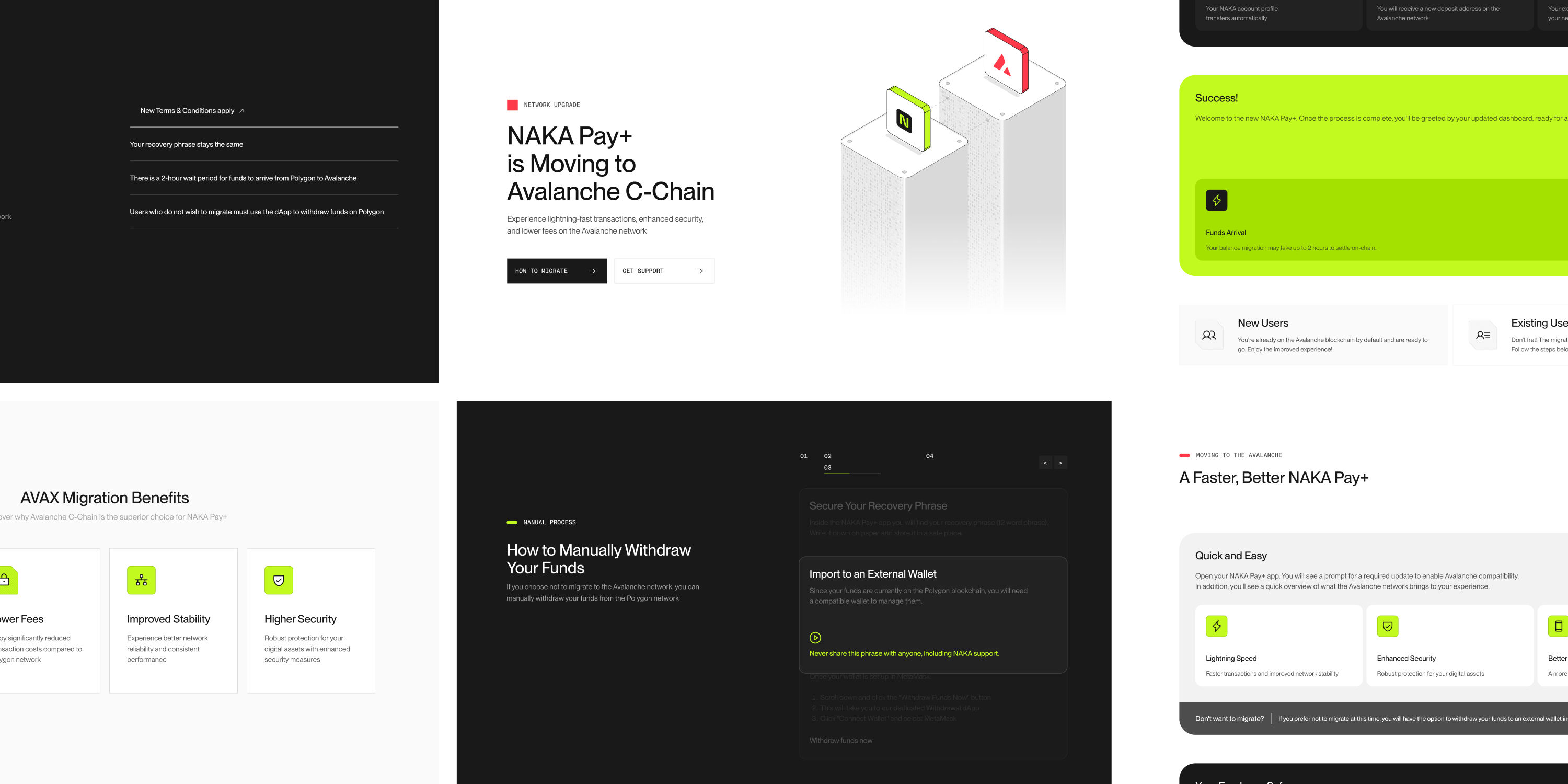
NAKA
Brand Design / Design System / Website / Motion Graphic / Templates
+
Briefly
Owned and evolved NAKA brand building a visual system that easy to scale and communicate clearly
As the NAKA expanded, communication became fragmented across channels and formats. So the task was not to produce more assets, but reducing decisions. Making NAKA a brand that felt trustworthy for financial infrastructure and still clear to people outside of blockchain
Process
Started with a full audit of touchpoints, then build a system around typography, grids, layout, motion and reusable components into a template logic. Applied it across explainers, social media content, ads and regional campaigns, website and product communication
Framework
Focus on reusable assets and components, which allowed to ship visual work faster, while keeping every interaction aligned, both visually and structurally
System in use
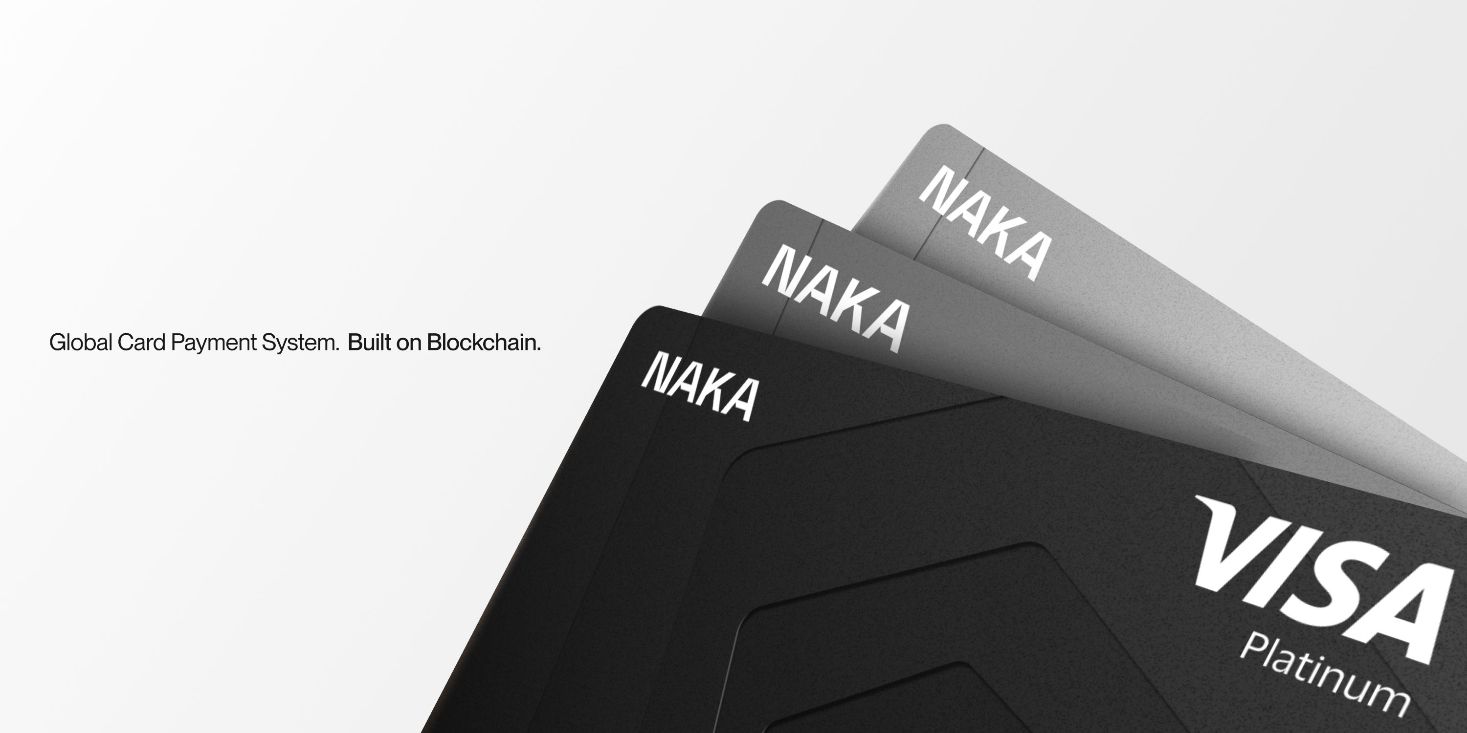
Adapted NAKA core identity to regional LATAM campaigns, and aligned it with Visa's guidelines for partnership launch - all without losing NAKA personality
NAKA showed how a well-built brand system can do more than look consistent, it can actively lower friction for teams and make complex communication easier to operate
Biconomy
Website Design / Brand Identity / Templates / Marketing Materials / Motion Graphic
+
Overall
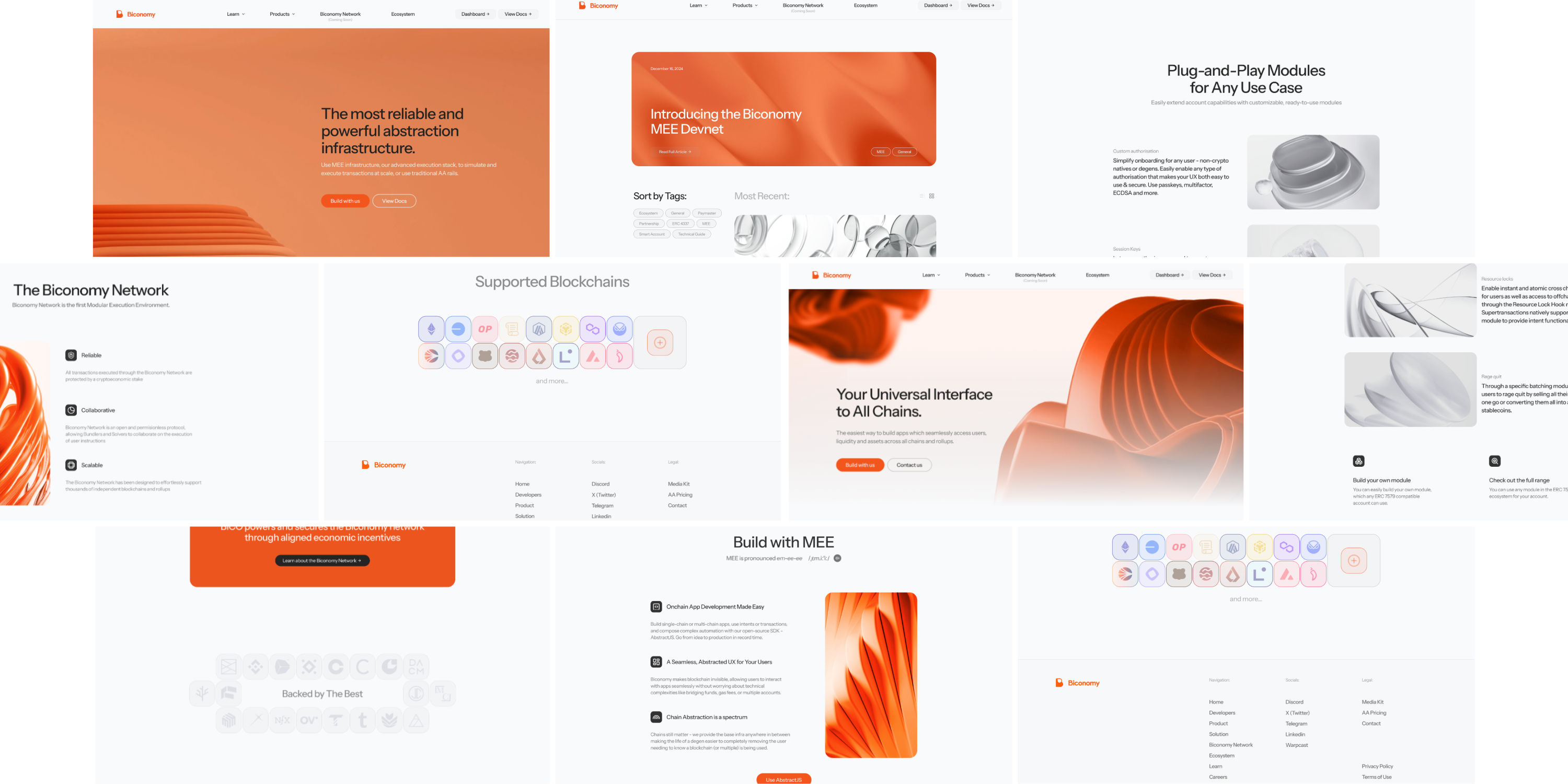
Rebranded Biconomy from a visually overloaded "web3 startap-ish look" into a clear, technical platform. Worked across landing, ecosystem onboarding and brand touchpoints to make the product easier to understand and navigate
Landing
Treated the landing as the first onboarding step. Rebuilt structure, simplified microcopy and created an interface preview demo instead of abstract visual - so users grasp the product within the first couple of screens
Designed a modular system of product pages with consistent logic. Each page answers what it does, how it works and where it fits. Reducing friction in understanding and maintaining a narrative and structure to simplify complex tech content
Design System
Built a simple and reusable system for website and adapted it to social channel communication. Cut unnecessary variation to keep focus on content, created motion easing system for both experiences, ensured consistency across all touchpoints
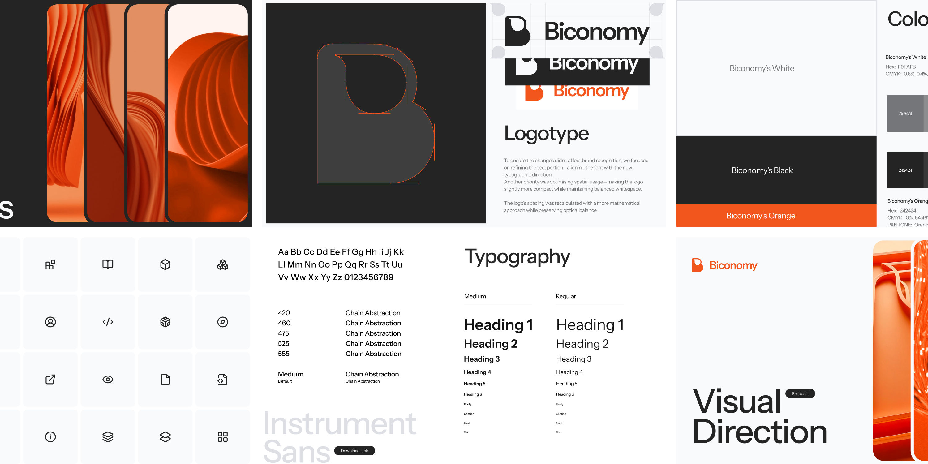
Visual Identity and Guidelines
Biconomy already had an established Visual Identity developed by design studio before. So instead of redefining the brand, my approach was to identify and fix what did not translate well into a product and context
I created a system that reduce visual noise, aligned typography and textual part of logo, and adopted color palette for content-heavy interfaces. All brand asset were transferred to a social media templates and slides design
Manifold
Product UX / Visual Identity / Marketing Templates
+
Launch System
Manifold was built as a product ready to enter the market, so the design work had to cover more than identity alone. The task was to prepare a full launch layer around the product: brand system, dashboard, landing surfaces, and pitch deck templates that could support fundraising, early user acquisition, and general promotion without feeling pieced together
Product Flow
The interface was designed for experienced DeFi users, but without the usual overload that comes with this category. I structured the dashboard around modular panels, clear hierarchy, and customizable data blocks, so users can monitor positions, performance, and system states quickly—without fighting visual noise
Core Mark
The logo is built as a precise looped structure that reads both as a knot and as a circuit. Grid-based construction, rounded app icon, and rim‑light rendering keep it close to OS/system icons, so it feels native on a device rather than “just a crypto logo”
Visual Tone
The overall direction stays controlled and physical: deep black, cold metallic light, soft gradients, blurred surfaces, rim highlights. It gives the product a sense of precision and restraint, placing it closer to software and infrastructure than to typical crypto branding. The result feels design-led, but still serious enough to support a product handling capital and automation
Various Projects
Brand Identity / Visual Communication / Web,Graphic,Motion Design
+
DefAI Hub (Agency, 2025)
AI Marketing House launched a hub bringing together AI tools for different marketing tasks. I built a visual identity, motion system and reusable templates that made the platform easy to expand as new tools were added without redesigning every update.
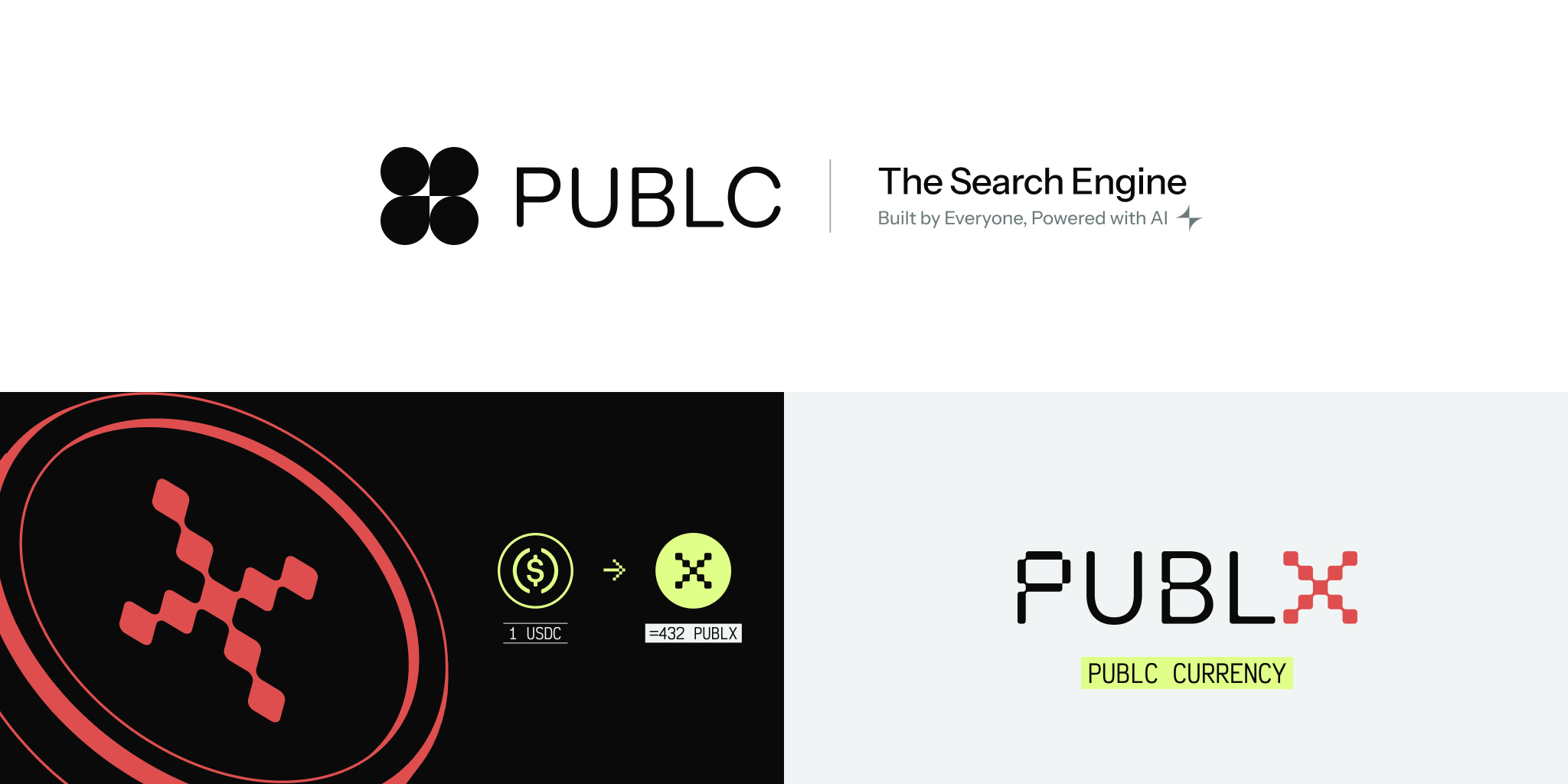
PUBLC + SocietyAI + PUBLX (Agency, 2024)
One product grew into three with different audiences but one shared foundation. After the branding workshop I separated the ecosystem into distinct sub-brands while keeping a single visual language that still felt like the same company.
Klaster (Agency, 2024)
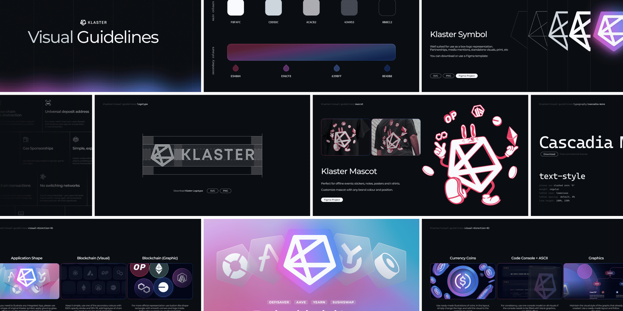
Created the brand identity for a Chain Abstraction product before its acquisition by Biconomy. The goal was to make a complex technology easier to understand while giving the product a strong presence across web, print, events and merchandise.
Monitok (2024)
Built a scalable visual system for a self-custodial trading app. Turned scattered brand assets into one reusable language that worked consistently across the product, landing pages, campaigns and social media.
Social Graph Ventures (2023)
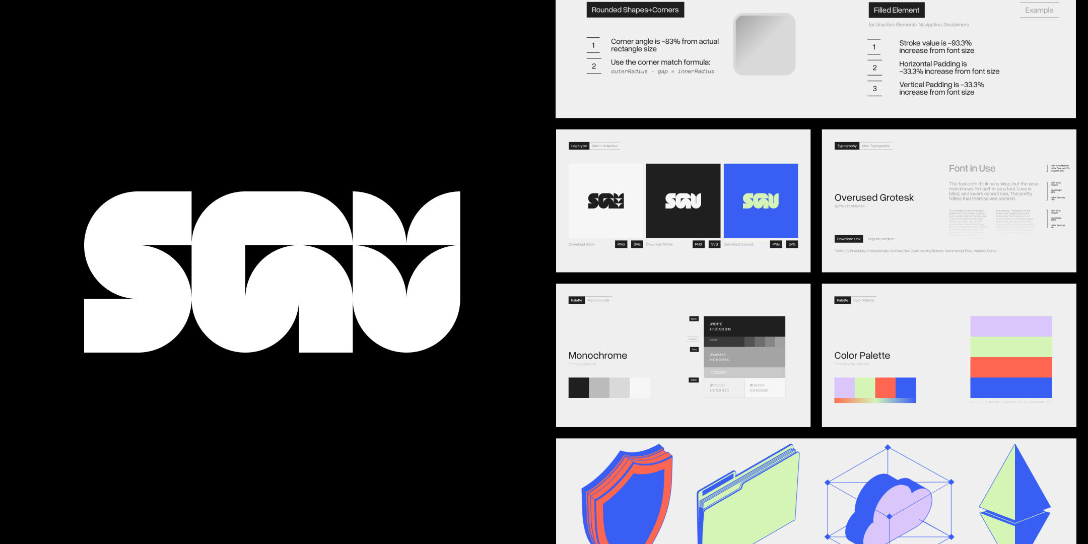
Developed the visual identity, presentation system and core brand assets for a blockchain-focused venture fund. Kept the visual language minimal so the portfolio and investment thesis stayed at the centre of the communication.
Tekuno (Agency, 2023)
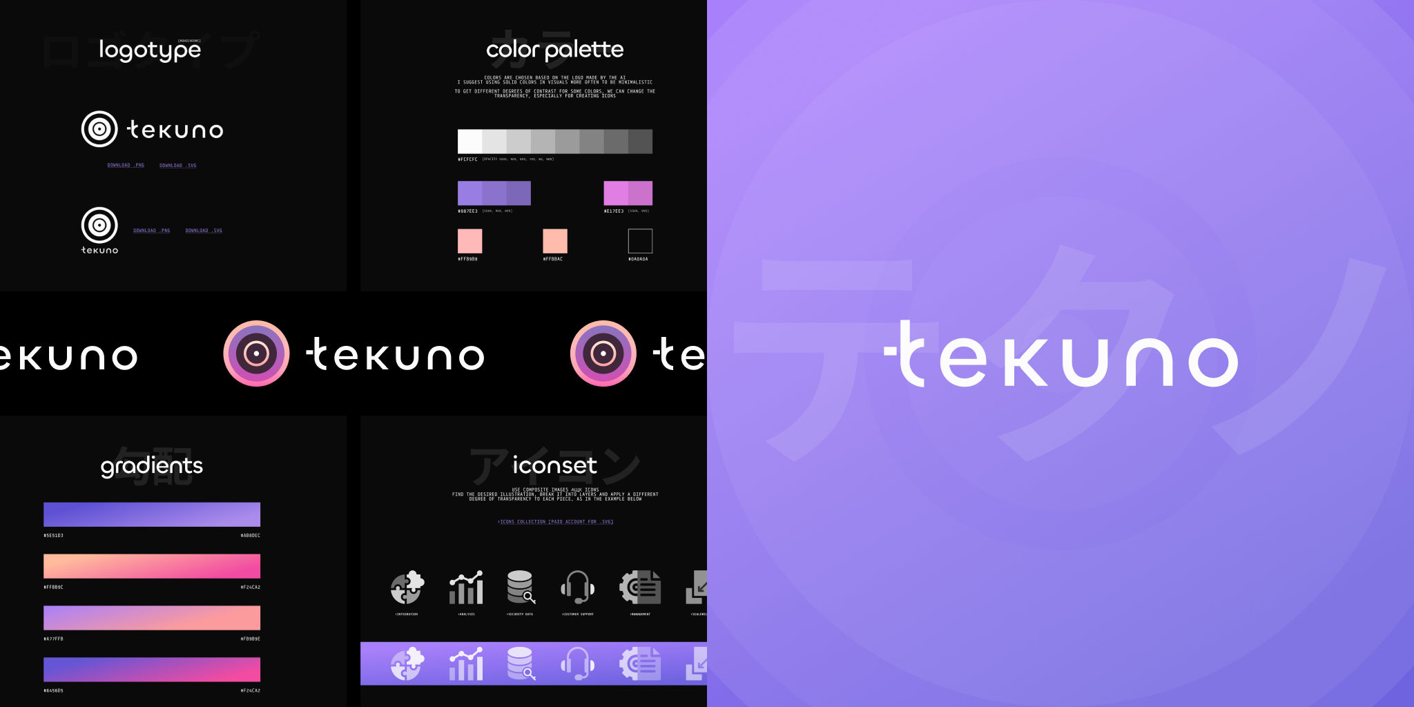
Built the brand identity for an NFT infrastructure platform, alongside a reusable content system and launch trailer. The project later became part of the Near Balkans ecosystem and secured a partnership with Mastercard.
Infinity Swap (Agency, 2024)
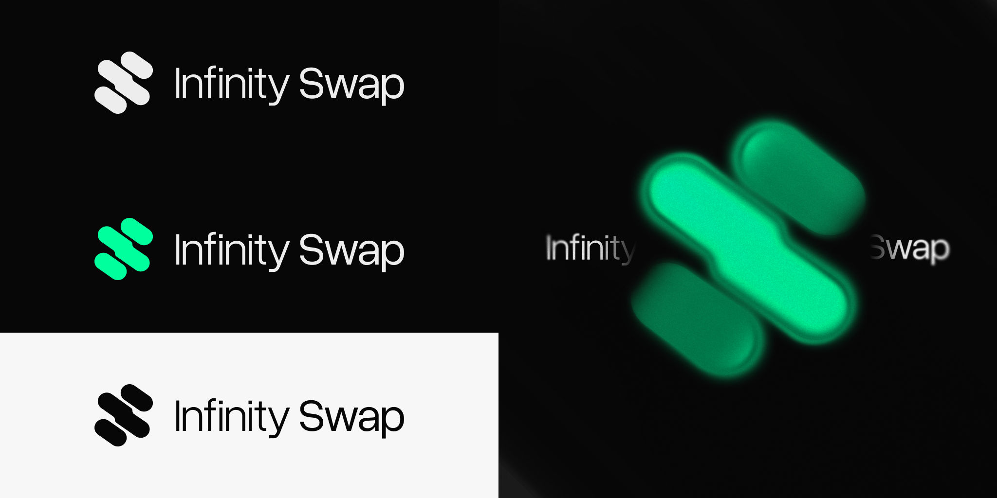
Refreshed the visual identity for an aeternity ecosystem product without changing the core brand. The goal was to give the product its own recognisable presence while staying visually connected to the parent ecosystem.
Rejected Campaign (2025)
Created a launch campaign for a fintech product in collaboration with Tether. Built the key visual and a motion template system that scaled consistently across marketing channels, including payment card visuals.